Starbucks:
Add a Feature


The Pet Menu Experience
The Starbucks app makes ordering fast and personal, but one familiar in-store ritual was missing: customers could not order a Pup Cup or other pet-friendly options through the app.
I designed a Pet Menu that allows customers to discover, customize, and order treats for their pets alongside their own drinks—without disrupting the Starbucks experience they already understand.
Independent Designlab capstone concept. Not affiliated with Starbucks.
Role: End-to-end UX/UI designer
Duration: 6 weeks · Approximately 75 hours
Tools: Figma, FigJam, Maze and Google Forms
A small request was breaking a seamless experience
Starbucks is known for creating a welcoming and personalized customer experience. Its mobile app extends much of that experience through convenient ordering, customization, and rewards.
However, customers ordering with their pets could not include a Pup Cup in their mobile order. They had to ask at pickup, interrupt a barista, or return to the line—creating friction at the very moment the app was supposed to remove it.
The opportunity was not simply to add another menu item. It was to bring an existing customer ritual into the digital experience in a way that felt natural to Starbucks.

The design challenge
Starbucks is known for creating a welcoming and personalized customer experience. Its mobile app extends much of that experience through convenient ordering, customization, and rewards.
However, customers ordering with their pets could not include a Pup Cup in their mobile order. They had to ask at pickup, interrupt a barista, or return to the line—creating friction at the very moment the app was supposed to remove it.
The opportunity was not simply to add another menu item. It was to bring an existing customer ritual into the digital experience in a way that felt natural to Starbucks.
Understanding what customers actually wanted
I conducted interviews with five Starbucks customers and pet owners, supported by survey feedback, affinity mapping, card sorting, and tree testing.
Rather than asking only whether people wanted a Pup Cup in the app, I focused on when they ordered for their pets, where the current experience broke down, and what information they needed to order confidently.

What all five pet owners taught me

A small gap in a familiar routine
Customers used mobile ordering to avoid waiting and simplify pickup. Having to make a separate request for a Pup Cup undermined that convenience..

Pets were already part of the coffee run
Participants did not view the request as an isolated novelty. For many, stopping at Starbucks with their pet was part of an established routine. They wanted the digital experience to recognize that relationship.

Different pets needed different options
Customers wanted clearer ingredient information, different sizes, and alternatives for pets with dairy sensitivities or dietary restrictions.

Pet options needed their own space
Research showed that users saw pet options as something that deserved their own section in the ordering flow, not just a hidden add-on. Including rotating seasonal treats helped make the pet menu feel more complete, easier to find, and more aligned with how customers already browse Starbucks offerings.

Some ideas were better saved for later
Research also surfaced ideas such as pet profiles, loyalty rewards, and charity partnerships. These ideas had value, but including all of them would have weakened the core experience. For this version, I focused on the features that directly supported ordering a pet item quickly and clearly.
Turning interview patterns into design direction
After the interviews, I used affinity mapping to organize what I was hearing across participants.

After mapping the interview findings,
six key patterns began to emerge:
Pets were part of the outing, not an afterthought. Participants described coffee runs as shared routines where their pets were already included.
The app created a gap in an otherwise convenient flow. Customers could order their own drink ahead, but pet items still required an off-menu request at pickup.
Users wanted a dedicated pet menu. The research pointed to interest in a visible pet section with rotating seasonal treats, healthier options, and items beyond the Pup Cup.
Health and transparency mattered. Pet owners wanted clearer ingredient information and options for pets with dietary needs or restrictions.
There was a larger brand opportunity. A pet menu could support convenience while also strengthening loyalty, emotional connection, and repeat engagement.
Community-driven ideas had future potential. Loyalty points, charitable partnerships, and pet-centered promotions resonated with users, but were better suited for later iterations beyond the MVP.
From those patterns, I created personas to represent the main behaviors driving the feature. Each persona helped clarify a different user need:


Together, the personas helped clarify the needs the Pet Menu had to support.
Marcus showed the need for inclusion.
Customers wanted their pets to feel like part of an existing Starbucks routine, not an afterthought.
Jose showed the need for trust.
Pet owners needed clearer ingredient information, safer options, and choices for pets with dietary restrictions.Maria showed the need for speed.
The Pet Menu had to fit into the existing mobile order flow without slowing down pickup.
04 — Choosing what mattered most
Research produced more ideas than could reasonably fit into one feature. I prioritized the decisions most directly connected to the validated problem.
Included in the MVP

A clearly labeled Pet Menu within the existing ordering experience
Three pet-friendly treat choices
A dairy-free Coconut Cream option
Pet-specific size choices
The ability to add the pet’s name
One combined checkout for the customer’s drink and pet item
Saved for later

Seasonal menus
Pet-focused loyalty rewards
Donation and charity partnerships
Broader personalization based on previous orders
Deferring these features kept the project centered on the most important task: allowing customers to order a pet treat without leaving their normal Starbucks flow.
A fresh idea inside a familiar flow
Adding a feature to an established product required studying the system before designing into it. I reviewed the existing Starbucks app and website to understand how the brand organizes menus, presents product cards, uses imagery, handles customization, and guides customers through checkout.
That research helped me identify the patterns the Pet Menu needed to follow: familiar navigation, card-based browsing, clear item hierarchy, consistent typography, Starbucks’ existing color language, and the same step-by-step ordering behavior users already know.

Turning Insights Into the First Wireframes
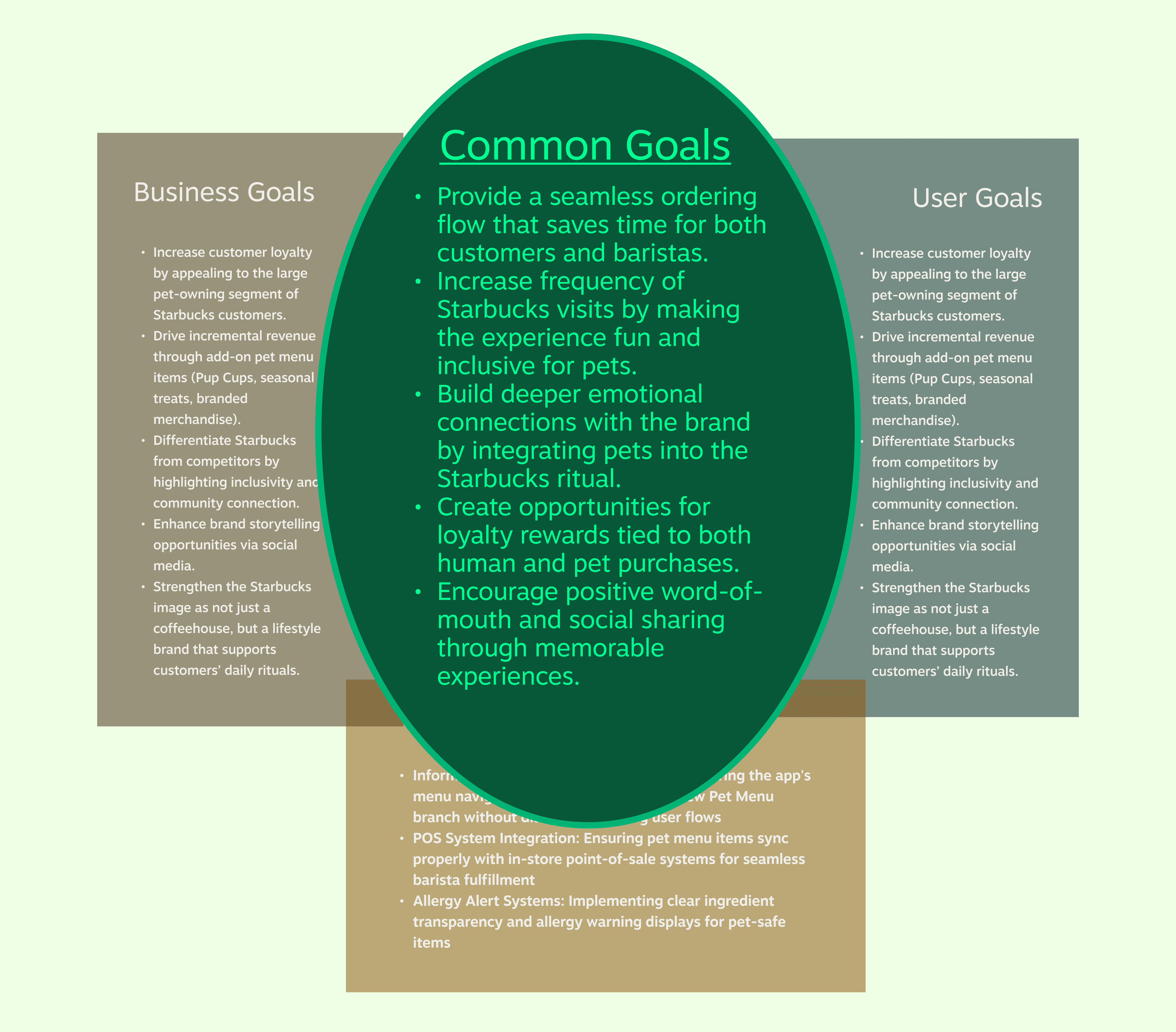
After researching through interviews, affinity mapping, personas, and Starbucks’ existing design patterns, I used a Venn diagram to narrow the direction of the feature. This helped compare what mattered most to users, what could support the business, and what made sense from a technical standpoint.
The overlap revealed the strongest shared goals: a seamless ordering flow, a more inclusive pet experience, emotional connection to the brand, and future opportunities for loyalty and engagement.
Those common themes shaped the key decisions that guided the MVP and the first version of the wireframes.
Decision 1
Give the Pet Menu a clear entry point
The shared-interest map pointed to a clear need: the feature had to save time for customers and baristas without adding friction to the existing order flow. If pet items were buried inside drink customization, customers could miss them. If the Pet Menu became its own major navigation system, it could feel larger than the problem required.
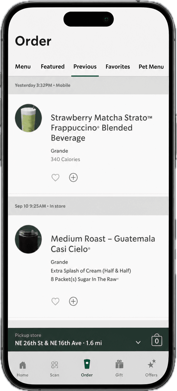
I placed the Pet Menu inside the familiar ordering experience and gave it a clear entry point. This made the feature visible when customers needed it, while keeping the app structure simple for customers who did not.


Decision 2
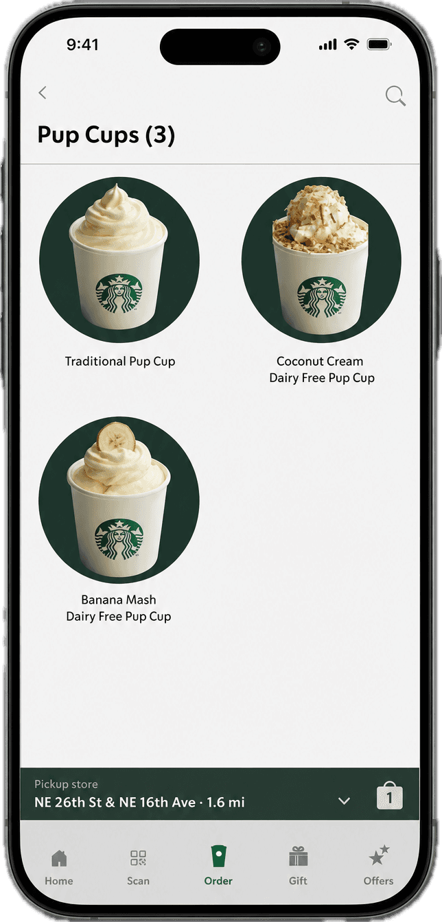
Offer more than one pet option
Research also showed that the experience needed to feel fun, inclusive, and useful beyond a single Pup Cup. Pet owners wanted their dogs to be part of the Starbucks ritual, but research also showed that one dairy-based option would not serve every pet.
I expanded the menu to include three focused treat options, including dairy-free Coconut Cream. This gave the Pet Menu enough variety to feel intentional, while keeping the choice set small enough to scan quickly.
Decision 3
Make the experience feel fun and pet-inclusive.
The shared-interest map pointed to a clear need: the feature had to save time for customers and baristas without adding friction to the existing order flow. If pet items were buried inside drink customization, customers could miss them. If the Pet Menu became its own major navigation system, it could feel larger than the problem required.
I placed the Pet Menu inside the familiar ordering experience and gave it a clear entry point. This made the feature visible when customers needed it, while keeping the app structure simple for customers who did not.


Building on behavior customers already understood
Early wireframes concentrated on where customers would discover the feature and how it would connect to an existing drink order.
The sequence used familiar Starbucks patterns throughout, reducing the amount of new information users needed to process.
The goal was for the final screens to look less like a concept added onto Starbucks and more like a feature that had always belonged there.
Once the structure of the flow was working, I moved the wireframes into high fidelity and focused on making the feature feel native to the Starbucks app.
The high-fidelity screens refined the experience in a few key ways:



User understanding of the new pet menu and ability to successfully order a treat for their dog.
Participants were asked to:
Reorder their usual drink
Add their pet’s name
Find and add an item from the Pet Menu
Review and complete checkout
The results
Test Overview
All five participants successfully completed the core ordering tasks. The strong completion rate and low task times suggested that the feature fit naturally into an experience users were already familiar with.

Task-Level Insights

Brand Fit & Adoption
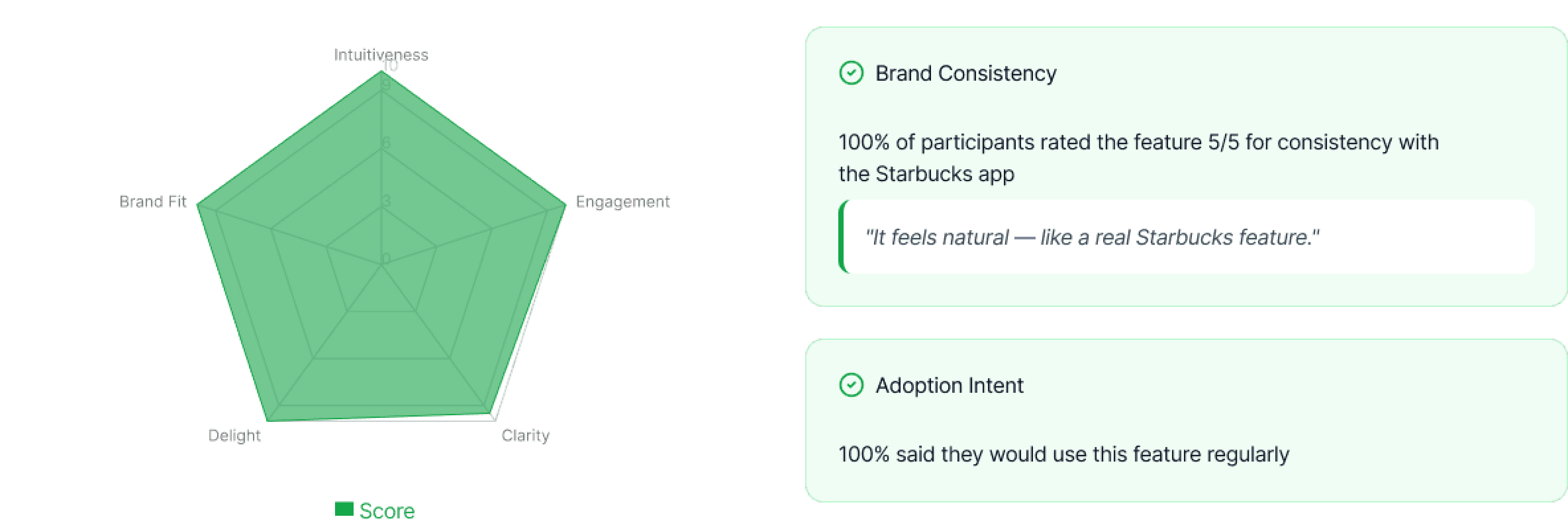
Success alone was not enough. Because the feature was being added to an established product, I also wanted to understand whether it felt like something that genuinely belonged in the Starbucks app.
All participants rated the feature 5/5 for brand consistency, and all said they would use it regularly. This suggested that the concept extended the existing Starbucks experience without feeling disconnected or unfamiliar.
Final Outcome
Usability testing confirmed that the current design was clear, intuitive, and aligned with the existing Starbucks experience. With 100% task success, a 0% error rate, and strong brand-fit feedback, the results did not reveal any issues significant enough to justify further changes.
For this project, the tested version became the final iteration.


Future development would begin with testing the feature with non-pet owners and baristas to understand its broader effect on navigation and store operations.
Additional opportunities include:

Seasonal and limited-edition treats

Expanded ingredient and allergy information

Pet-related rewards

Charity and animal-welfare partnerships

Personalized recommendations based on previous orders