Polished & Curled


Designing a responsive salon website that supports the owner and improves access for residents and caregivers in a senior living community

Role: End-to-end UX/UI designer
Duration: 6 weeks · Approximately 75 hours
Tools: Figma, FigJam, Maze and Google Forms
Polished & Curled is a salon located inside Allegro Senior Living and open to both residents and the public. Despite using Square for payments and booking, appointments, client communication, and scheduling still relied heavily on phone calls, texts, paper records, and the owner, Christina's direct involvement.
I designed a responsive website that clarified services and pricing, connected clients to the existing Square booking system, and preserved phone support for residents who preferred personal assistance.
01
The Opportunity
A trusted salon was being held back by a manual experience
The challenge
Was not simply to put the salon online. It was to modernize the booking experience without losing the personal trust and flexibility that made the salon successful.
Many residents were older adults who were accustomed to booking directly with Christina by phone or text. For them, moving to an online system meant changing a familiar routine, so the experience needed to feel simple, reassuring, and easy to use across different levels of technical confidence.
At the same time, the current process required Christina to manage incoming calls, route appointments to individual stylists, maintain paper schedules, process payments, and communicate changes manually. Clients also had no dependable online source for services, pricing, hours, or staff information.
The experience needed to support three connected groups.

Residents
Residents needed a simple way to understand services, see prices, and begin booking without feeling overwhelmed or uncertain.

Caregivers
Caregivers needed to coordinate appointments remotely without relying on repeated calls, texts, and personal recordkeeping.

Business
Christina needed a system that reduced interruptions and administrative work while retaining Square and supporting future growth.
02
Research
Understanding the people behind the salon experience

Interviews
I conducted interviews with Christina, the salon owner, three residents who regularly used the salon, and three caregivers who scheduled and paid for residents’ hair services. The goal was to understand the salon’s operational needs alongside the different ways residents and caregivers managed appointments, payments, communication, and technology.
The research focused on:
How Christina managed scheduling, payments, reminders, and client communication
Which manual tasks created the most time and administrative strain
How residents found services, pricing, and appointment information
How caregivers booked and paid for services on a resident’s behalf
What caused confusion or uncertainty during the process
How comfort with technology affected booking and payment preferences


03
Insights That Shaped the Design
What the Current Experience Revealed
Turning research patterns into design priorities
I organized observations from the interviews and empathy maps into an affinity map, then compared those patterns with gaps identified in the competitive analysis. Five recurring insights became the foundation for the website’s structure, content, and booking experience.

Booking depended too heavily on the owner
Appointments were managed through paper books, calls, and texts. Each stylist maintained an individual schedule, while Christina handled incoming requests and routed clients manually.
This created limited visibility, frequent interruptions, and a single point of dependency.


Services and pricing were difficult to find
Residents often relied on printed brochures, signs, word of mouth, or an in-person visit to understand what the salon offered. Caregivers wanted a current digital service list they could reference remotely.
Technical confidence varied significantly
Some participants were comfortable managing appointments and payments online. Others preferred calling Christina and were uncomfortable entering payment information digitally.
The solution could not assume that every user would recognize common mobile patterns or want a fully self-service experience.


Trust was already the salon’s strongest asset
Caregivers consistently described Christina as patient, empathetic, and an important part of their loved one’s care team. Their confidence in the salon was built primarily through personal relationships, reliability, and familiarity.
Confirmations and reminders provided reassurance
Residents wanted help remembering appointments, while caregivers wanted visibility into appointments, payments, and completed services when managing care remotely. Participants already trusted Square’s digital receipts and automated payment features.

04
Defining the Product Direction
Aligning user and business needs
The research revealed a clear overlap between what residents and caregivers needed and what would help Christina operate the salon more efficiently. Users needed transparent services and pricing, trustworthy staff information, flexible booking and payment options, and dependable confirmations. The business needed fewer manual inquiries, less scheduling strain, and a system that could support growth without replacing Christina’s personal approach.
The intersection of these needs established the core product goal:

Explore services and transparent pricing
Learn about the salon staff and their specialties
Book appointments through Square
Pay at the salon or remotely on a resident’s behalf
Receive clear confirmations, reminders, and updates
Access phone support when personal assistance is preferred
05
Structuring the Experience
Bringing services, people, and booking into one clear path
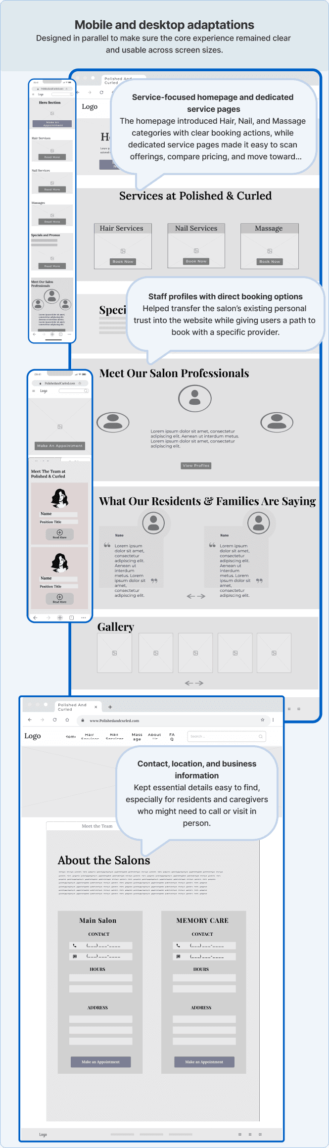
I created a shallow information architecture that kept important content close to the homepage and made online booking easy to access.

I began with low-fidelity desktop and mobile wireframes to establish hierarchy, navigation, service organization, and booking placement before introducing visual styling.
The early designs included:
06
Testing the First Direction
Before moving into higher-fidelity design, I wanted to test whether the initial layout, navigation, and information hierarchy made sense to users. I conducted moderated mobile usability testing with five participants using the low-fidelity prototype.
Participants were asked to:
Locate manicure services and begin booking
View staff information and book with a specific provider
Find the salon’s location and hours

07
What Testing Changed
Making salon information easier to find
Testing went well overall, but several users struggled to find the salon’s hours and location.
Before
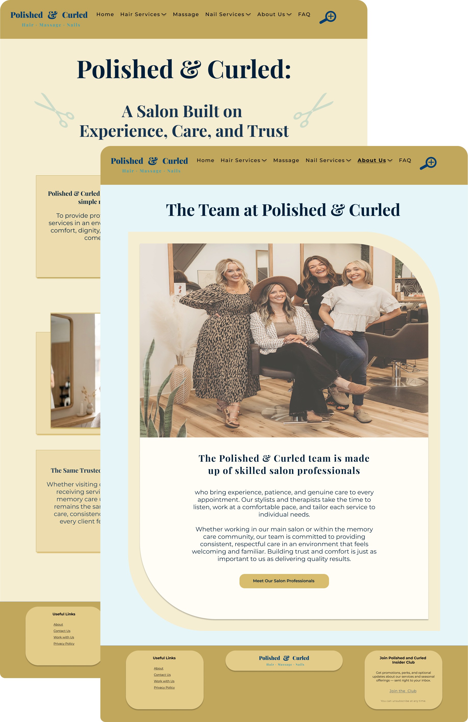
Hours and location were nested on the same page as Meet Our Salon Professionals, making them easy to overlook.

After
I reorganized About Us into a dropdown with separate pages for Meet the Team and Salon Information. This kept both sections grouped logically while making hours, location, and contact details easier to find without competing with staff content on the same page.
08
From Wireframes to a Responsive Experience
Refining hierarchy, accessibility, and responsive behavior
With the core flows validated, I used high fidelity to strengthen the visual hierarchy and make the experience easier to navigate across devices.
Booking Support
Prominent booking CTAs paired with a secondary Request a call option.

Staff Content & Trust
Expanded profiles help build confidence before booking.

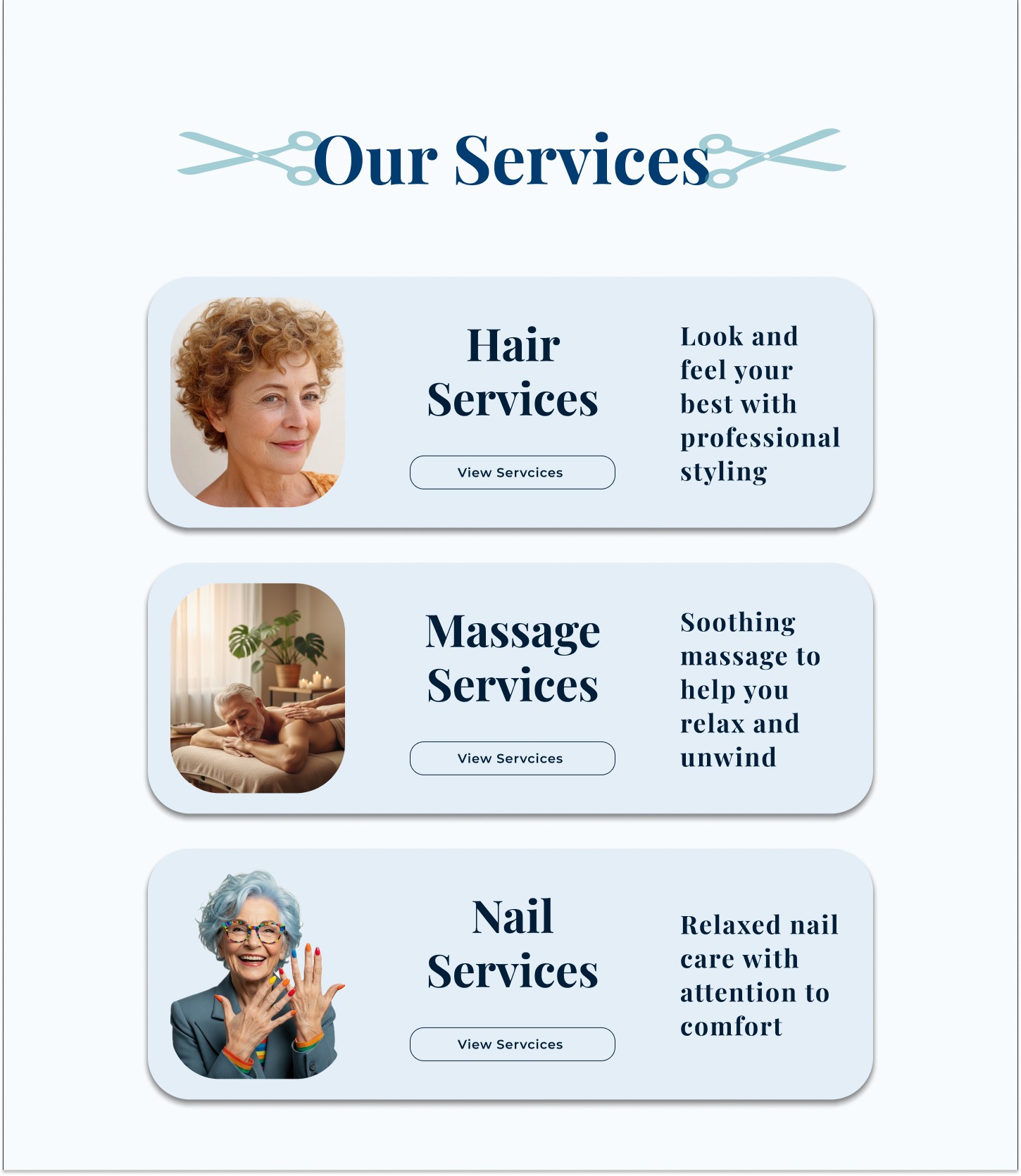
Service List
Clear categories make options easier to scan and select.
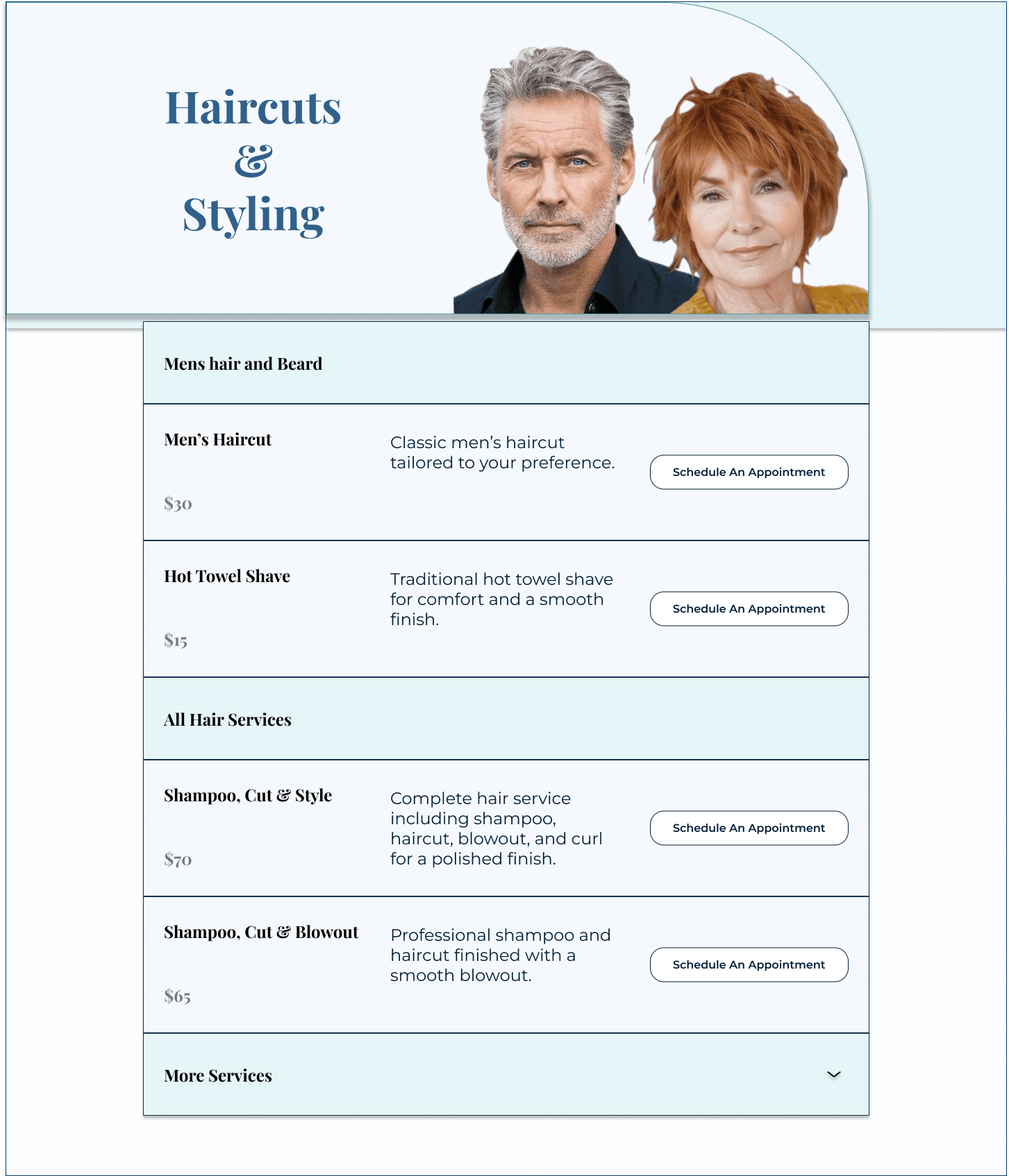
Clear Content Hierarchy
Category labels, services, prices, and CTAs were visually separated to make each section easier to scan and understand.
Mobile responsiveness
Layouts, spacing, navigation, and content hierarchy were adjusted for smaller screens to keep key actions clear and easy to use.


09
Testing the Final Experience
Could residents and caregivers book without assistance?
I conducted a second round of moderated usability testing with three residents and two caregivers using the mobile high-fidelity prototype.
Participants completed tasks involving:
Finding hair and nail services
Locating prices
Comparing service options
Beginning the booking process
Assessing trust and confidence

10
The Final Experience
The final website created a clearer bridge between the salon’s personal service and its existing Square infrastructure.
Residents could:
Understand services and pricing
Learn about the salon and its staff
Begin booking independently
Request personal assistance when needed
Caregivers could:
Research services remotely
Choose a provider
Begin scheduling without waiting for a callback
Receive clearer digital confirmation
Christina, the salon owner could:
Reduce phone-based scheduling and service questions
Direct more clients into online booking
Spend less time coordinating appointments manually
Keep Square as the salon’s core booking and payment platform
Support growth without losing the personal service clients valued


11
Reflection
Modernization did not have to mean removing the human connection
Some users wanted complete digital independence. Others trusted Christina and still preferred to call. The strongest solution supported both behaviors while making the essential information easier to access.
The most important lesson was knowing when not to over-design. Testing showed that the overall service and booking structure worked well. Instead of changing successful flows, I focused on targeted improvements to navigation, hierarchy, and reassurance.
This project strengthened my ability to connect research findings to specific design decisions and explain not only what changed, but why it changed.
12
Next Steps
Extending the experience without losing its simplicity
Future development could explore:
A digital same-day waitlist
Caregiver and resident profiles
Appointment and payment history
Easier rescheduling for recurring appointments
Post-service photo updates for remote caregivers
Centralized staff schedule visibility
Expanded research with non-resident public clients
Combined manicure and pedicure packages
These additions could extend the experience while preserving the clear, focused structure established in the MVP.